I had a great response to the last movie poster showcase, 21 Great New Movie Posters, and soon after dharmeshG on twitter posed a very potent question: What are some of my all-time favourite movie posters?
“Too many to list here,” I tweeted back. “I’d need a whole blogpost to cover them!”
And so, this.
Both DharmeshG and I decided to take a week to track down some of our favourites, and to each put together a posts featuring them on our respective blogs (Check out DharmeshG’s blog for his poster blogpost!). That week turned out to be insufficient, however, and nearly two weeks and hundreds upon hundreds of posters later, here I am with my modest* list of 101 of my favourite movie posters.
*(and I do mean modest — my initial shortlist was four hundred strong!)
This is by no means a definitive list — there are so many great posters I left out of this, but that’s because I had to keep the number down to something, er, vaguely manageable. Well, let’s get started, shall we?
A for Animation

I’m putting these first and foremost, because I don’t think posters for animated films get enough attention or respect (that animation itself gets no respect is a rant for another day). Truth be told this has something to do with the fact that what is generally perceived of as animation in the English-speaking world involves Happy Meal tie-in CGI blockbusters starring furry animals or wisecracking Ogres, and the posters of those films invariably involve simple head shots of their characters in order to quickly imprint themselves upon their target audience.
If, like me, you grew up generally unimpressed by Western animation, then you’re probably quite used to the reams of excellent artwork that is to be found in the rest of the world’s animation, both in the films themselves and in the posters that promote them. It’s no coincidence that five of the posters featured in this section are for Japanese movies, as that country is responsible for many of the greatest animated films of all time.

But don’t think I’m entirely dismissive about the West, though. Good — sometimes even great — animation is to be found there, and I can think of no finer example of a great movie with a great poster than Mask of the Phantasm otherwise known as the greatest Batman movie ever made (yes, I know all about that other one).
Bond, James Bond

Honestly, I could have done a whole post just on all the James Bond posters over the years (and hey, maybe one day I will!). But today I’m showing you my all time-favourites, and that generally means posters from Bond films starring my favourite (and the greatest) James Bond of all time, Sean Connery.

Bond movie posters are always a bit special, no matter which era they’re from, or indeed, even if they’re not quite ‘official’ Bond movies such as the hilarious mess of a movie that 1966’s Casino Royale was.
Fast forward forty years, and the official, serious, all grown-up Casino Royale also has this great poster. It may swap the lush art style of the ’60s for a Photoshop-heavy treatment, but it’s still a kickass one-sheet.
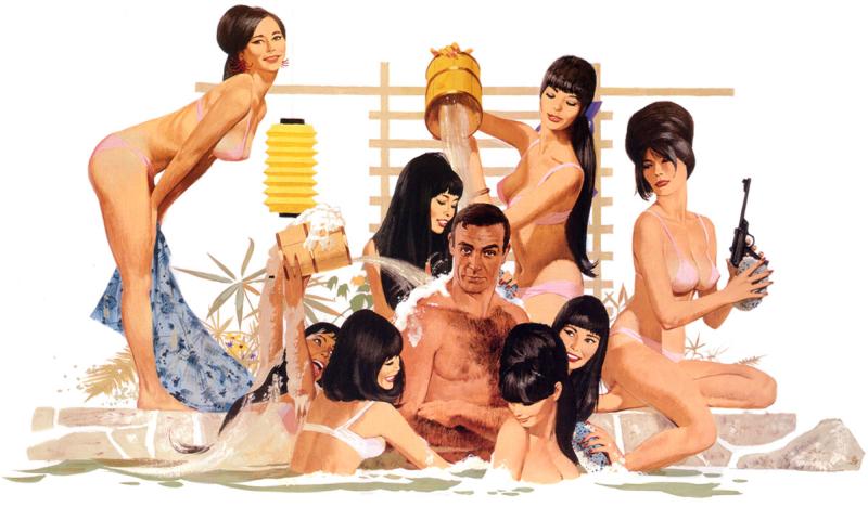
And speaking of the ’60s, the reason the art in all the illustrated posters looks so awesome is because they were all drawn by the same artist, Robert McGinnis. McGinnis was truly a master, with a distinct style that almost made Bond hyper-real, larger-than-life, just like the movies. Without him I don’t know if we’d have quite the same impression of 007.
Girls, Girls, Girls!
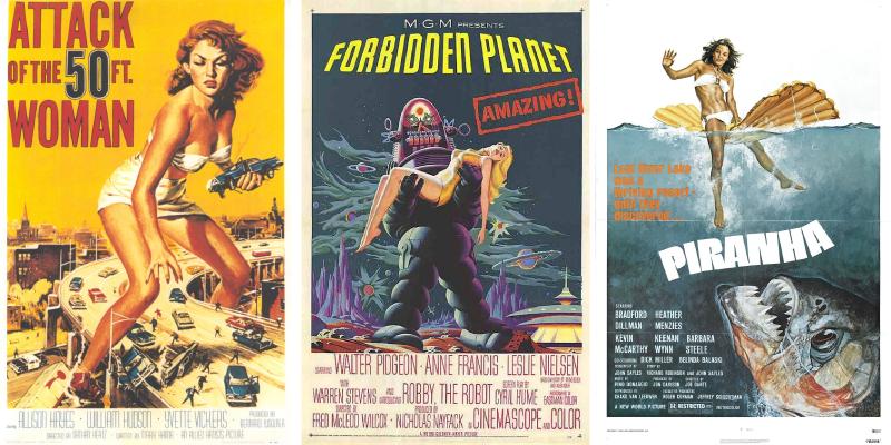
We lead naturally from cinema’s No.1 ladies’ man, to, of course, ladies! The surefire way to get a passerby’s attention is to stick a pretty lady in a bikini on a poster, and these one-sheets are only some of the most famous and well-designed examples of them (and there’s another idea for a future POSTERity entry…).
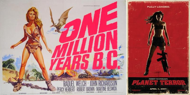
It’s a technique that’s still being used to this day, albeit with more twists (which do you look at more — gun, or leg?). But does one really need the twist? You aren’t telling me audiences in 1966 were queuing up to see the dinosaurs…
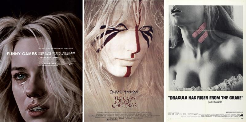
Now and then, of course, a twist is most welcome, as evidenced by the three posters above. I will probably never want to watch Funny Games, but that is one hell of a poster. And how about that Dracula one? You have Christopher Lee starring, and you focus on two band-aids? Now that’s confidence.
A Picture is Worth a Thousand Words

Confidence is something that the average movie poster doesn’t seem to have a lot of. Crammed to the edges with the faces and names of its stars, cluttered with explosions and attractions and whatnot, it’s easy to forget that sometimes all you need is a single good picture to draw audiences in.
What all of this set of posters has, I feel, is mood. Now that’s a very hard thing to convey in a movie itself, let alone in a poster, but I think these each do a fabulous job.
Get Closer
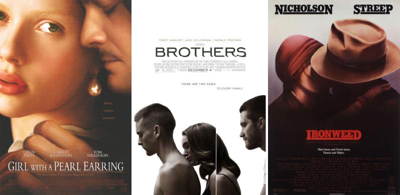
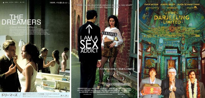
It’s safe to say that most human stories are about intimacy in some form or another, and movies are no exception. While there are plenty of romcoms that feature two people looking dreamily into each others’ eyes, I’m drawn to ones that are a bit different.
Sex Sells
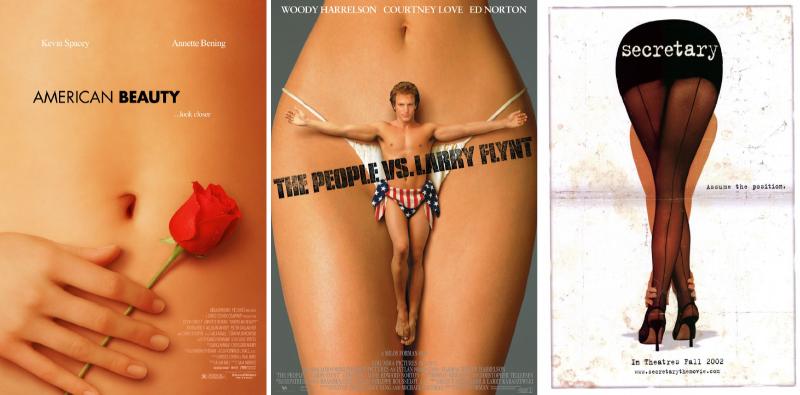
And then there are the times you don’t want to be subtle at all… 🙂
Face Time
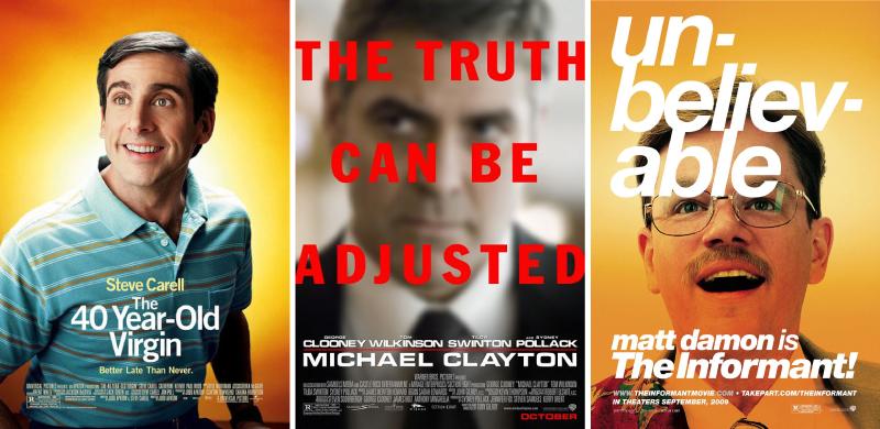
I tend to find most ‘single face’ posters pretty boring. Like the aforementioned ones which try to cram their whole cast in, face posters usually signify that it’s this year’s big ‘star vehicle’, and that you really shouldn’t care because so-and-so huge actor/actress is in it. So when a movie poster does go with the single face or mid-shot, and then makes it not only memorable, but intriguing? I’m sold.
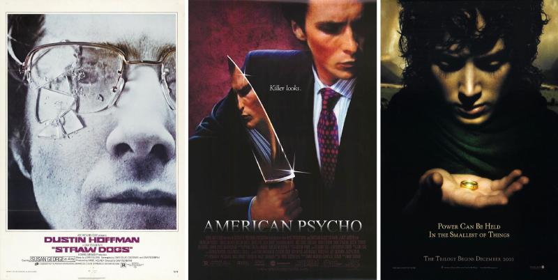
The simplest of things can make a movie poster memorable. The right prop, for instance. Or a mundane one put to a strange use.
Eyes
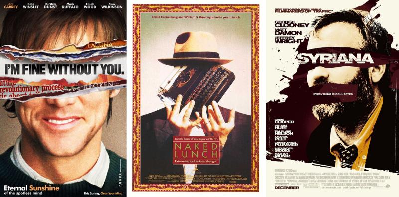
Good posters, like good stories, are as much about what they withhold as what they reveal, though.
Mouths
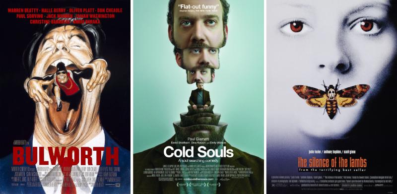
And since it’s a still image and not a moving one, what good is a mouth, eh? We aren’t (thankfully) in the era of talking movie posters yet, so it’s quite natural for poster designers to run their mouth a bit.
War Machines
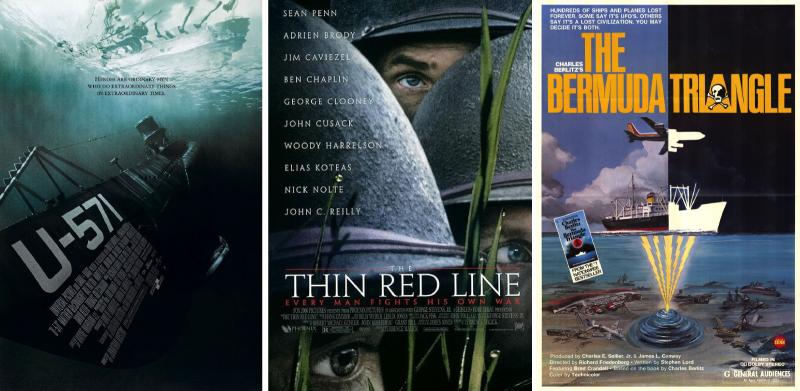
War movies (and movies featuring the military in general) also tend to follow a pretty generic poster style. Lots of sepia colors or the ever-reliable explosions. The Bermuda Triangle isn’t actually a war movie (it’s a documentary I think I’ve seen ages and ages ago), but it certainly featured a lot of military hardware disappearing into mysterious fog.
What? Yes, I said documentary.
Menace
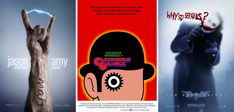
They say that every great movie has a great villain. There are many exceptions to this, of course (Kiki’s Delivery Service springs immediately to mind) but it’s quite often the villain or the anti-hero that steals the show, and makes for the most memorable performance.
…and sometimes, some very memorable posters!
Surreality
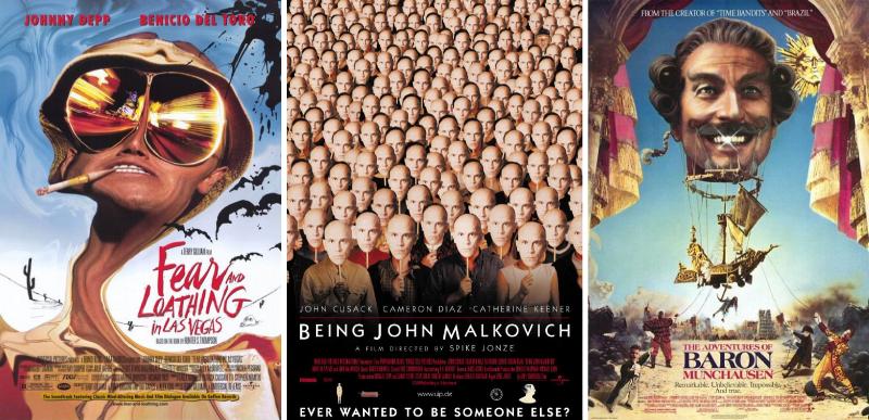
Movies give us some of our closest glimpses of realities that only exist in our minds, so why should the posters be left behind? It’s only fitting that the master of the surreal, Terry Gilliam, has two posters featured in this section. One of these is probably more of a surreal film than the others, but I’ll let you decide. 🙂

Of course, the surreal image isn’t just something that can be used for surreal films. Quite often a fantastic and evocative image can convey the mood and ideas of a very realistic movie much better than a straightforward photo.
Set the Mood

I talked about mood before, and how many movie posters lack it. Well, not these three, that’s for sure. Pulling from the entire gamut of illustration, design, and photography, these three say more about their movies than entire synopses would.
The Illustrated Film
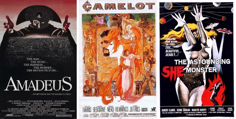
And sometimes, you don’t need photos at all!
Superpowers
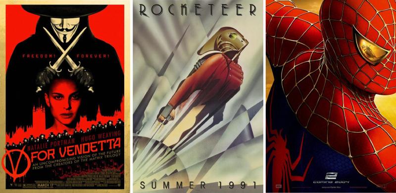
There are plenty of great superhero posters that are just perfect for throwing up on your bedroom wall, but I think these three are great works of art too.
(And yes, kids, The Rocketeer is a proper superhero movie. Look it up.)
Into the Stars
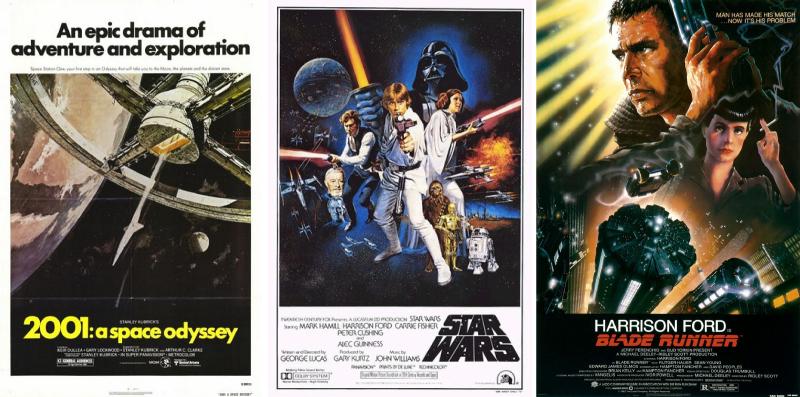
When I was a kid I too wanted to be an astronaut, to live in The Future, ride a space-ship, and shoot a raygun. I have a raygun now (don’t worry, it’s harmless), and it’s 2010 as I write this (officially The Future), and while I haven’t been to space yet, these posters always bring a smile to my face and remind me of the fantastic worlds out there that they portrayed.
Immaculate White
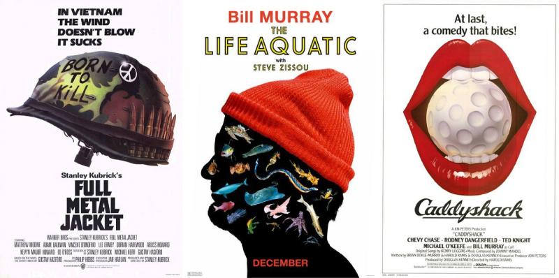
Now let’s get serious.
In order to craft a fine movie poster, you don’t really need an army of artists and CG technicians, do you? Sometimes all you need is a talented designer with an idea and a white piece of paper.
And when the ideas is strong enough, you don’t even need to fill in all the white bits either. 🙂
I Know the Type
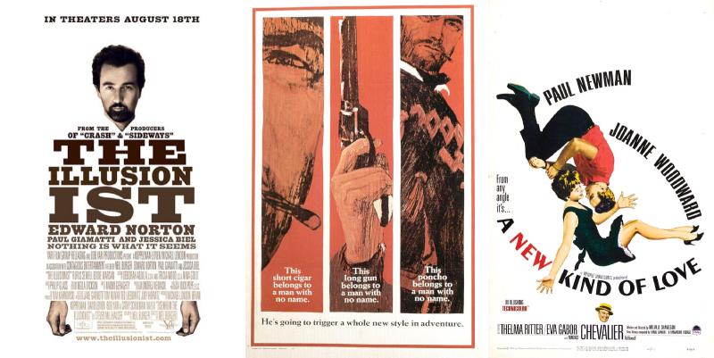
Any graphic designer who does not confess to an intense love of typography is a designer I do not want to know. And so any poster that dares to use type and image in awesome ways (sometimes, in the case of the central example, ridiculously simple ways) gets my vote!
Epic Epicness
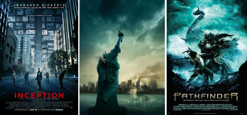
At the other end of the scale, we have posters that try — and succeed! — at portraying the sheer scope of the adventures they promise.
(I have it on good authority that Pathfinder is not that great a movie, but oh man, what a poster!)
Blue Movies
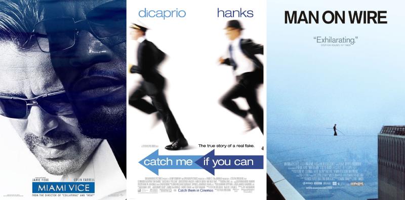
Let’s get one thing clear: in design terms, ‘monotone’ is not the same as ‘monotonous’. A poster’s palette may stay parked firmly in one segment of the colour wheel, but that doesn’t mean it’s not going to be memorable.
Everything in its Place

It’s nice to organise things, to keep things ordered and neat and totally not full of disembodied stars’ heads (and explosions — don’t forget those!).
Primary Colours

Just to show you that blue is not the only colour out there, in case you were wondering.
Silhouettes
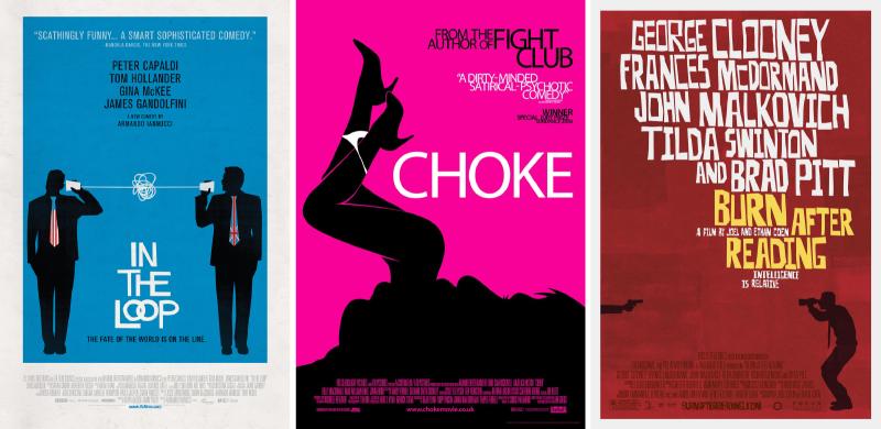
Nor should one have to rely on photographs when a good silhouette will do nicely.
Graphic Graphics
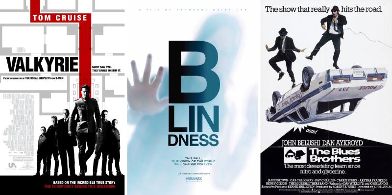
Oh, who am I kidding? I’m a graphic design geek as much as a movie geek, and posters like this just make my heart sing!
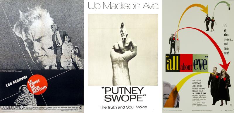
Keep it Simple, Stupid

You don’t even need a whole lot of stuff to make your point. The All That Jazz is one of my most favourite posters, and it’s not only devoid of colour, but also any kind of photo, illustration, or graphic — it’s all text!
I See a Pattern Emerging

I hope this assault of a hundred posters hasn’t got you seeing strange patterns in front of our eyes. Wait, if you are, then it just may be these particular posters! 🙂
Well, this post took a fair bit of time to put together, but I think it was worth it! There’s actually several hundred more posters I could show you, but those will have to wait for another time. Hope you enjoyed this as much as I did.
Make sure you also visit @DharmeshG’s blog for his favourite posters!


