The great thing about being a movie lover is that long before you buy your ticket and plonk down in your seat with a bucket of popcorn, your love of movie-related imagery has already whetted its appetite. In the lobby, out in the street, or even on the internet, you’ve probably been seeing posters of the movie you’re anticipating (and many of movies you are not).
Movie poster design is as much an art now as moviemaking itself, and we thought we’d celebrate that art by showcasing 21 great posters for new movies that have recently caught our eye.
There are no photoshopped monstrosities here, and we’ve grouped them by style, talking a little bit about them and what makes them special to us.
We hope you like it!
Stand & Deliver

Let’s start things out simple, but with the twist. Many movie posters are all about star power, packing in all the big names they can. Recently, nobody’s done that better than the Inception posters. Each and every one of them has been wonderful, but we like this one in particular for its unusual composition.
On the other end of the scale, but still within the same style, is the poster for Get Him to the Greek. There’s nothing particularly inventive about it, but sometimes all you need for a good comedy is a slighty weird photo in an otherwise mundane setting.
Pattern Recognition
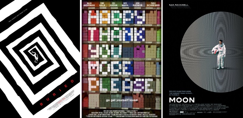
Hooray for modern art! From the very Saul Bass-inspired Buried poster to the retro science fiction book jacket style of Moon, it’s a treat to see poster designers trying out something bold and whimsical.
Stick to the Classics
 Dover Koshashvili’s Anton Chekov’s The Duel, Yang Hae Hun’s Who’s That Knocking At My Door?
Sometimes all you need in a movie poster is a few strong images — maybe even one — and a good formal composition. Both these intriguing posters do just that, drawing your eye in with the silent stories they tell.
Graphic Visuals
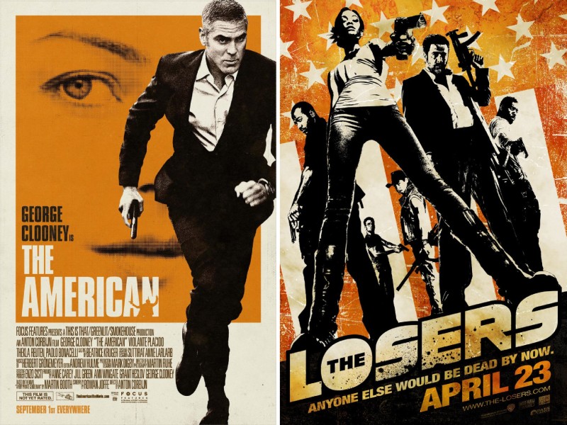 Anton Corbijn’s The American, Sylvain White’s The Losers
I love me a good piece of retro poster work. While we’re eagerly awaiting The American, the perfectly 1970s look of its gorgeous poster has done much to heighten our anticipation.
On a similarly orange note is the poster for The Losers, which captures the mood and feel of the comic book its based on.
Photo Finish
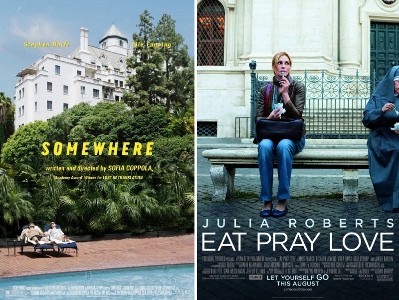 Sofia Coppola’s Somewhere, Ryan Murphy’s Eat Pray Love
A picture is worth a thousand words. You know this already, being a movie fan, but it’s always great to come across a single photograph — so many times less than the hundreds of thousands of frames that make up the average movie — that perfectly represents the mood and world of the movie itself.
White Space
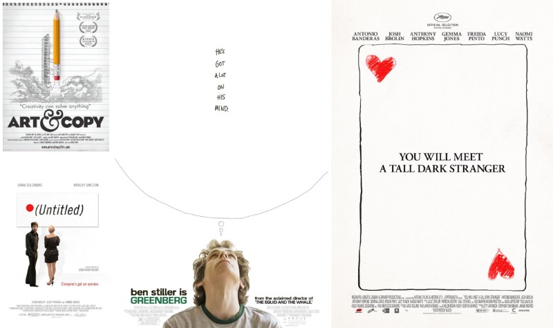 Doug Pray’s Art & Copy, Jonathan Parker’s Untitled, Noah Baumbach’s Greenberg, Woody Allen’s You Will Meet a Tall Dark Stranger
As any artist or designer who’s ever been under a deadline will tell you, there’s nothing as terrifying as a blank page. On the other hand, sometimes the blanker the page the better, as these four minimal posters prove.
Of all four, Woody Allen’s You Will Meet a Tall Dark Stranger has us most pleased. No doubt this teaser poster will give way to something with shots of its massive ensemble cast, but it’s a bold and intriguing poster to lead with.
Kick it Up
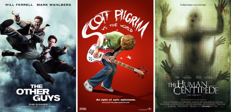 Adam McKay’s The Other Guys, Edgar Wright’s Scott Pilgrim vs. the World, Tom Six’s The Human Centipede
Very few movie posters capture the energy of the movies they represent, or successfully convey their unique concepts. Just one look at these three, and you know you’re in for something a bit off-kilter.
The Other Guys, like its protagonists, seems to have fallen out of the sky, but it’s an instantly likable poster. And when you realise that Adam McKay (Anchorman) is at the helm, even just a look at the one-sheet is enough to bring a smile to your face.
We’ve raved about Scott Pilgrim’s trailer before on the site, but that gorgeous red poster is something we wouldn’t mind hanging on our wall.
And last, but not least, The Human Centipede, a movie we’ll admit to being too squeamish to actually watch, and whose poster alone sends chills down our spines.
Everything Comes Together
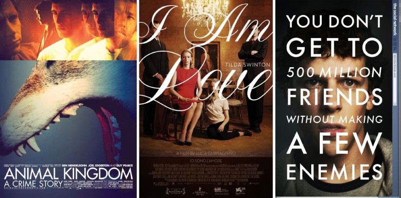 David Michôd’s Animal Kingdom, Luca Guadagnino’s I Am Love, David Fincher’s The Social Network
We’ve saved the best for last. These three posters wowed us in their use of photos, typography, and layout. These aren’t just great movie posters, they’re great pieces of graphic design, period.
Though The Social Network is the only movie we’d previously known about, the strength of the other posters alone is enough for us to want to check out both Animal Kingdom and I Am Love.
That’s exactly what a great movie poster should do.
We hope you liked this little (well, okay, not so little) feature. It was a lot of fun to put together. If you’ve seen any movie posters you really liked, do leave a comment below telling us about it. We’d love to hear from you.


