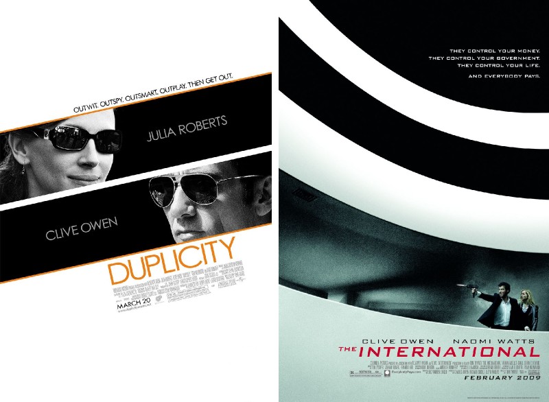
If you walked into the cinema this week expecting to see a movie starring Clive Owen, Naomi Watts and Julia Roberts as ex-spies hot on the trail of a corrupt bank, you might be forgiven if the movie you did see was missing a star or so. Chances are that both The International and Duplicity will be playing in multiplexes, and aside from a leading man, they do have another striking thing in common: the posters.

These two posters were on opposite ends of the hall and I was drawn to them from afar due to their strong graphics, but until I was close enough even I didn’t realise they were for two different movies. I’m not sure, but I think they were even made by the same design studio (Ignition Creative)! I know these are probably large organisations with dozens of projects running simultaneously in different departments, but don’t you think somebody would have taken a step back and realised they were churning out two very similar posters for films starring the same guy?
And it’s not even that the poster reflects a strong branding effort that is carried throughout the visual identity of either film, as the other posters of the movies are almost nothing like these:

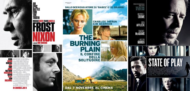
I can’t say I really like either one, but of the two I prefer The International’s, but that’s only because it reminds me of the movie’s fantastic Guggenheim action sequence (even though Naomi Watts wasn’t in that scene). I looked around and this particular style of movie poster is quite popular now. Here are a few more I found:

Now, I have to be honest that while they are nice designs, I do sense a bit of sameness in all of them (come on, that Frost/Nixon poster could be put up next to the ones at the top and you might think they’re all from the same film!). In all cases these particular posters are not like the rest from the same movie, which leads me to wonder why even high profile movies have such haphazard branding. Is there no single person overseeing the visual look of the film’s print and other campaigns? I don’t expect the director to be a control freak, but surely they have a hand in approving these things. I hope.
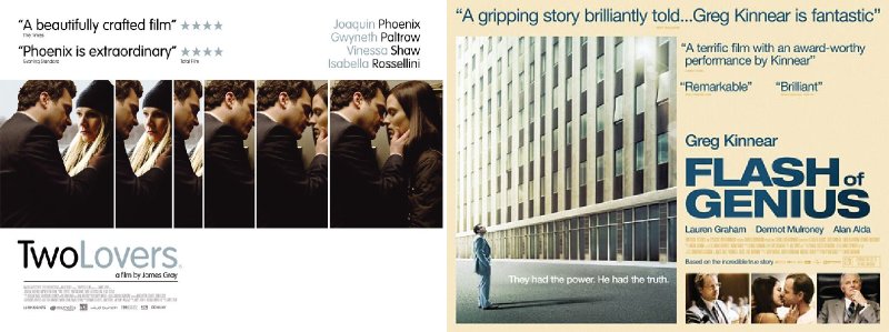
But if the above posters represent shallow attempts to evoke a style of film that had its heyday in the 70s, then there are still films whose poster do just that, and also stand on their own two feet as good examples of graphic design, such as these two:

I quite like this resurgence of bold, graphic 1970s style movie posters (when it’s done well, of course). You could attribute it to the fact that a lot of filmmakers are heavily influenced by the cinema of the 1970s, or that the current popularity of comic books makes this sort of imagery more acceptable. Today’s photo-manipulated monstrosities turn a stroll through the cinema lobby into a freak show or, at best, deliver an unintentional chuckle or two. Regardless, it’s nice to see a well-designed poster for a movie you like. A good poster can distill the experience and good memories of a movie down into an single image, and that’s a thing of some power.
It’s just a bit odd that so many designers would think of such similar images.

